The backdrop collection
Seven colours, one for your kind of wedding.
Soft colour.
Real birch wood.
Every backdrop is chosen to sit beautifully beside our birch hardwood photobooth. Browse the colours, pick the one that feels like your day, and we will bring this to your day.
Browse the colours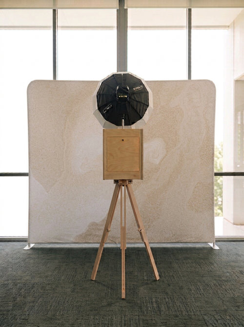
(04) Sands
which one feels like you?
Why the colour matters
Your backdrop should feel like your wedding.
It’s in every single print your guests take home and every photo they post that day. So we made choosing it the easy part.
The collection
Browse all colours
We believe a backdrop should flatter your theme, sit easily beside your decor and styling, and make every print look like it belongs in your wedding.
- One birch
hardwood photobooth - Multiple
backdrop colours - Props matched
to your event - Print overlays
in your palette
take your time with this bit…
Airy · Bright · Timeless
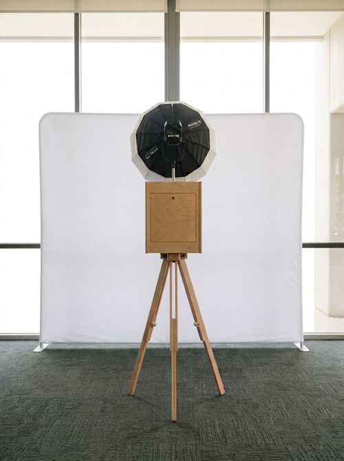
White
For the couple who wants every face to be the story.
White bounces soft light back onto your guests, so skin looks fresh and every outfit shows its true colour. It’s the choice that never dates in your album.
Loves being paired withGarden parties, minimalist styling, lunch banquet
Calm · Cool · A little dreamy
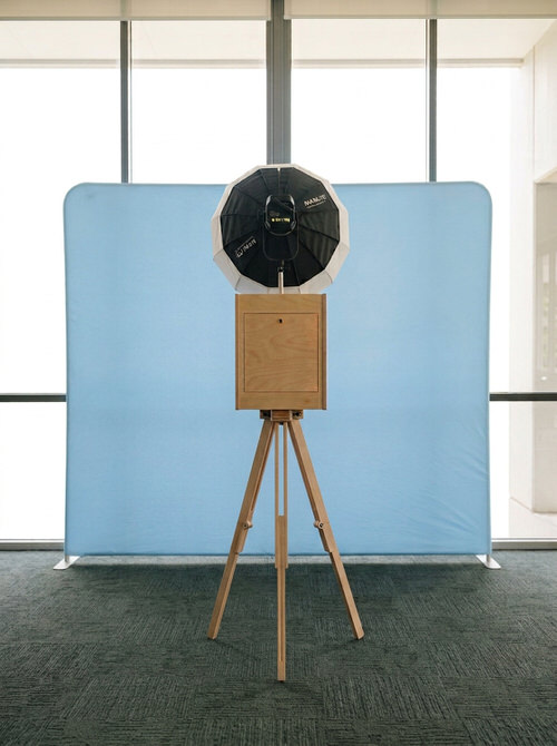
Baby Blue
For the couple who wants the room to breathe out.
Baby blue feels like a clear morning sky. It flatters pastels, whites and dark navy suits, and gives every print a gentle, easy mood.
Loves being paired withDaytime receptions, seaside venues, your something-blue details
Tender · Playful · Glowing
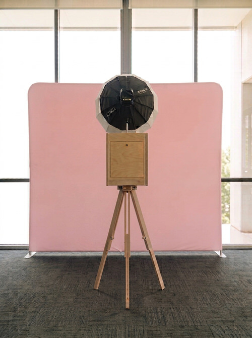
Baby Pink
For the couple who wants the photos to blush.
Pink warms every skin tone and makes the corner feel like a celebration from the very first shot. Sweet, without trying too hard.
Loves being paired withFlorals, tea receptions, blush and champagne palettes
Grounded · Warm · Quietly luxe
Sands
For the couple who loves linen, rattan and golden hour.
Sands sits naturally beside our birch hardwood photobooth, so the whole corner reads as one considered piece. Warm, soft and kind to every outfit.
Loves being paired withRustic and boho styling, beige, sage and terracotta palettes
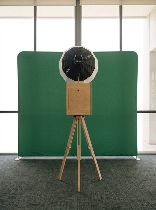
Lush · Rooted · A little bold
Green
For the couple who brings the garden indoors.
Deep green makes whites and golds glow, and gives your prints a rich, editorial depth. It holds its own in a room full of flowers.
Loves being paired withGreenery-heavy styling, emerald and gold, heritage venues
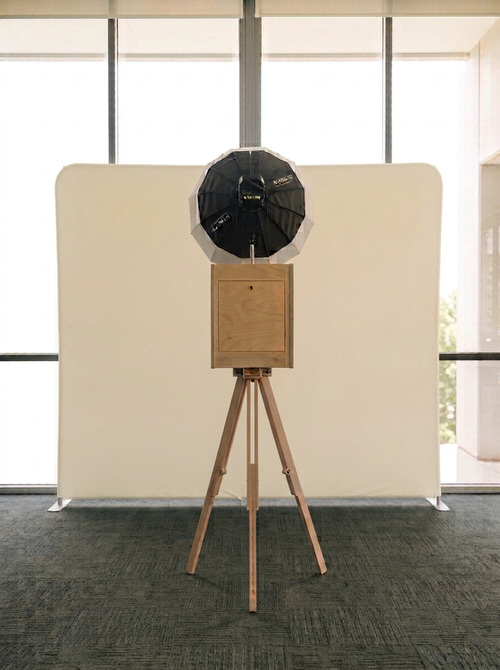
Sunny · Cheerful · Full of light
Butter Yellow
For the couple who wants the party to feel like sunshine.
Butter yellow is soft enough for pastels and bright enough to lift an evening ballroom. Your guests will be smiling before the countdown starts.
Loves being paired withSpring palettes, daytime parties, retro and whimsical themes
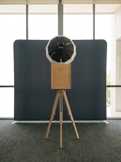
Dramatic · Sleek · Evening glamour
Black
For the couple who wants every print to look like a magazine cover.
Black lets faces, sequins and jewellery do all the talking. Pair it with black & white prints and it’s pure old-cinematic.
Loves being paired withBlack-tie dinners, ballroom banquets, monochrome styling
( How choosing works )
Picking a colour here is the easy first step.
Choose your favourite on this page
Tap “Choose” on the colour you love to give us a starting point for your wedding.
Confirm it through WhatsApp or in your intake form
Once your date is secured, you confirm your backdrop in one short intake form.
We will design the overlay
Your print overlay complements your backdrop and palette. We will email you for your review and sign-off.
Still deciding?
Torn between two? Most couples are.
Tell us both when you check your date. We’ll help you pick the one that suits your venue and your palette.
HappiSwitch
HappiSwitch is a Singapore photobooth company — you will find us servicing clients at weddings, corporate events, brand activations and bespoke parties. For our other services not covered here, write to hello@happiswitch.com.
Singapore · UEN 53513197J
© 2026 HappiSwitch · Privacy